Vienna Family Dental5 designsOct 12Round notes
Open a design and press Alt+Shift+S (⌥⇧S) to leave a note on part of it, or use its Feedback button. Notes wait on the design until you build a round with it.
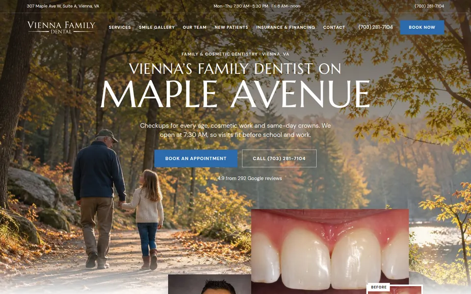
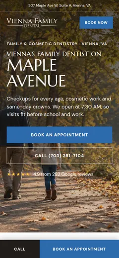
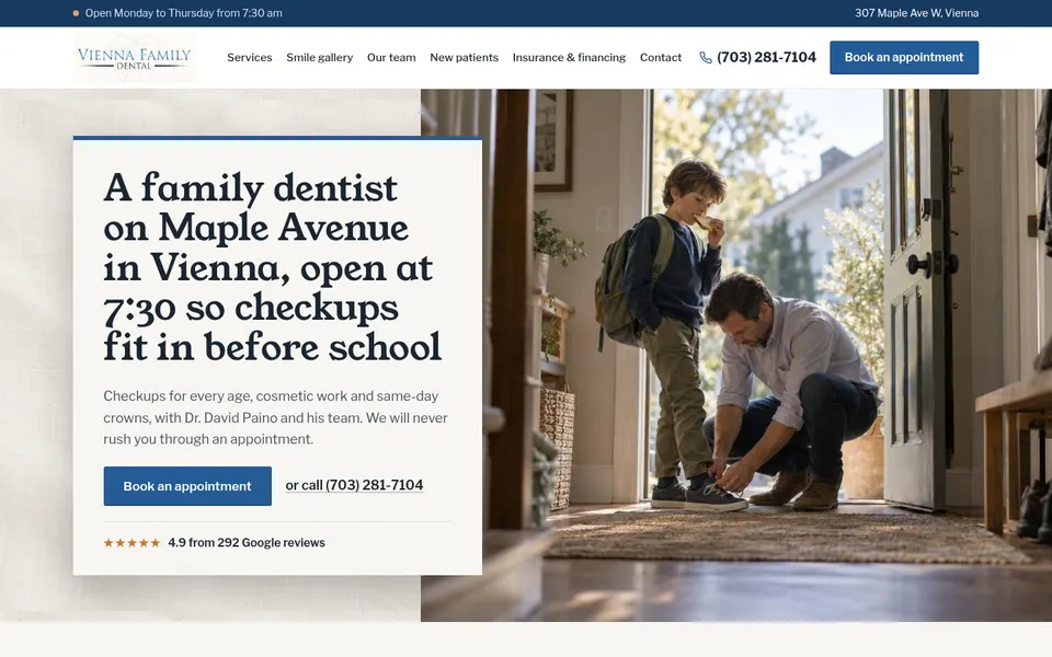
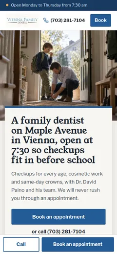
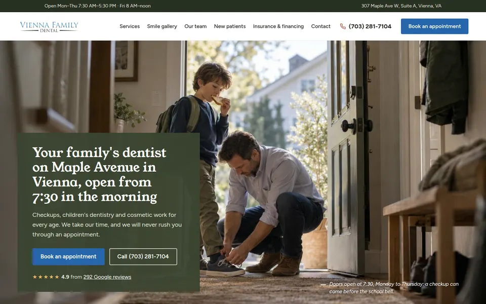
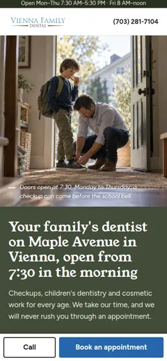
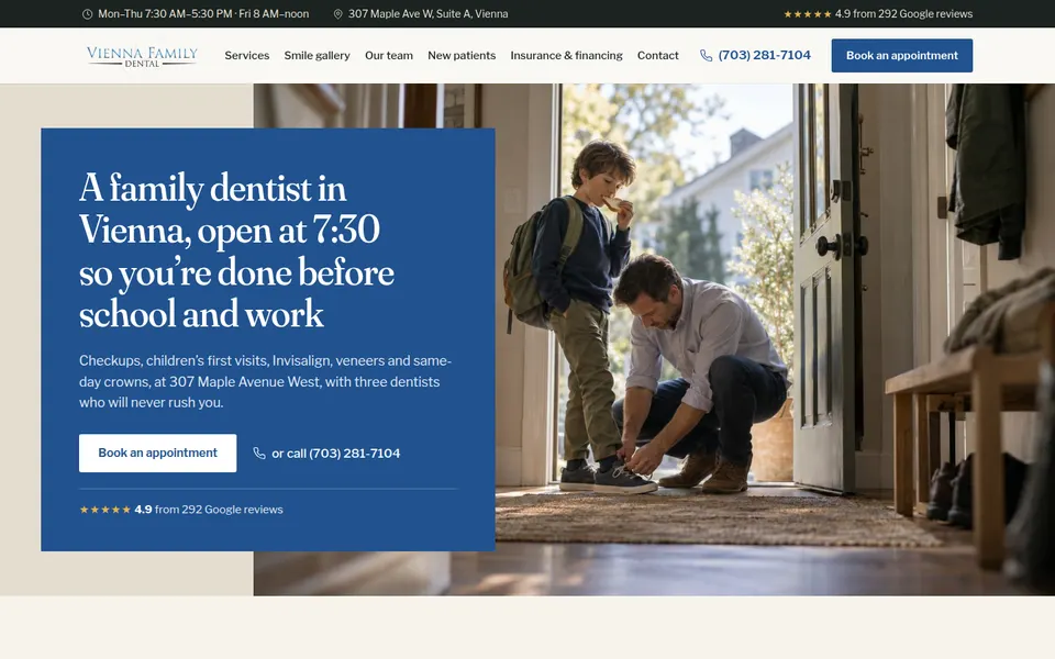
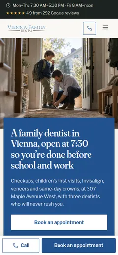
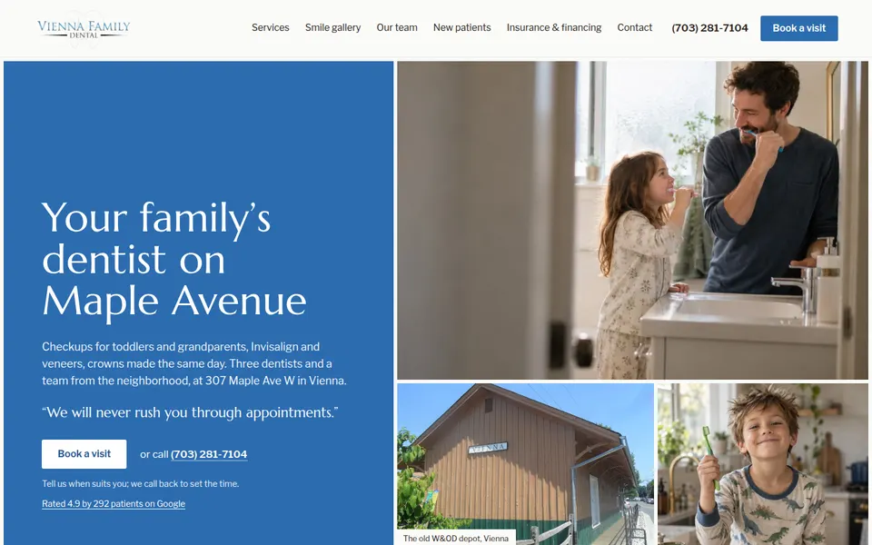
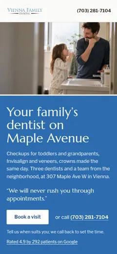
The best round yet: photo-rich, local, finished. One thing must go: headlines that explain. "A family dentist on Maple Avenue in Vienna, open at 7:30 so checkups fit in before school" is an H1 written by a machine. Headlines are short (about 2-7 words), one idea, said like a person would; the facts go in the line below. That goes for every section heading too.
And three of the five designs ended up alike: the same library photo as the hero, the same panel over it, the same headline. That's why each designer now gets a share of the library and a direction of their own.
Leave notes on the designs you'd like revised (open one and press Alt+Shift+S), then pick designers for the rest: up to six in all. Your notes on the round go in on the next page.
Build the next roundThe floor went up a lot and the review loop is why: every reviewer score rose round over round (e.g. 7.5 → 8 → 8.5) and four of five reached 'ship'. Pages are photo-rich, local (real Vienna photos, the depot, the trail, Maple Avenue), and none looks SaaS. But variety went down: three designs chose the same library photo for the hero, with nearly the same text-panel-over-photo layout and the same '7:30, before school' headline, and the same handful of library images (the woman in the armchair, mother and toddler) appear in all five. Shared inputs now outweigh the strategies. Next: give each designer a different slice or style of the library (or its own generated set), and assign directions so the methods can't converge on the safest good answer.
| S10 · Anthropic's frontend-design skill 7/10 | A confident blue panel beside a photo collage that includes a real Vienna landmark (the old W&OD depot). Feels like a neighborhood practice. Real Vienna photos further down (the depot, autumn streets) carry the 'on Maple Avenue, in the middle of Vienna' section. | The middle is a long run of photo-beside-text sections; the services list is small text under small photos. Several library images are the same as the other designs (the woman in the armchair, mother and toddler). |
| S7 · Blueprint remix 8/10 | The most distinct: a full-bleed autumn trail hero with big classical capitals, 'MAPLE AVENUE', which reads premium and traditional, like a good country inn. A real before/after overlaps the hero. Nice pacing of light and dark bands, a dark booking section to finish. | Letterspaced caps headings everywhere get a little monotonous; some middle sections are plain photo-plus-text; the closing dark section is heavy. |
| S11 · Local practice (hybrid) 8/10 | The most local: an 'Our neighbors in Vienna, Virginia' section of real local photos set like pinned prints, the depot, the trail, a map-like feel. A warm off-white panel over the photo with a strong serif headline; good copy throughout; tidy services mosaic. | The hero is the same photo and nearly the same layout as D and E. The page is long and the lower half (insurance, booking, FAQ) is plainer. |
| S6 · Photo art director 7/10 | Rich and photographic throughout, a forest-green palette that suits a leafy town, a good 'neighborhood practice' photo collage of Vienna, a strong results band. | The same hero photo and panel layout as C and E; very long (the most sections); several sections feel like the same photo-left/text-right block. |
| S9 · Section posters 7/10 | Calmer than last round's posters: two strong colors (blue, green) used as full bands, a good results band, the dentist's story set well, an illustrated tooth in the corner, a nice insurance strip with the three steps. | The same hero as C and D; the varied 'poster' sections are less distinct now that they share the library's photos; the bottom (map, booking) is ordinary. |