Vienna Family Dental5 designsOct 12Round notes
Open a design and press Alt+Shift+S (⌥⇧S) to leave a note on part of it, or use its Feedback button. Notes wait on the design until you build a round with it.
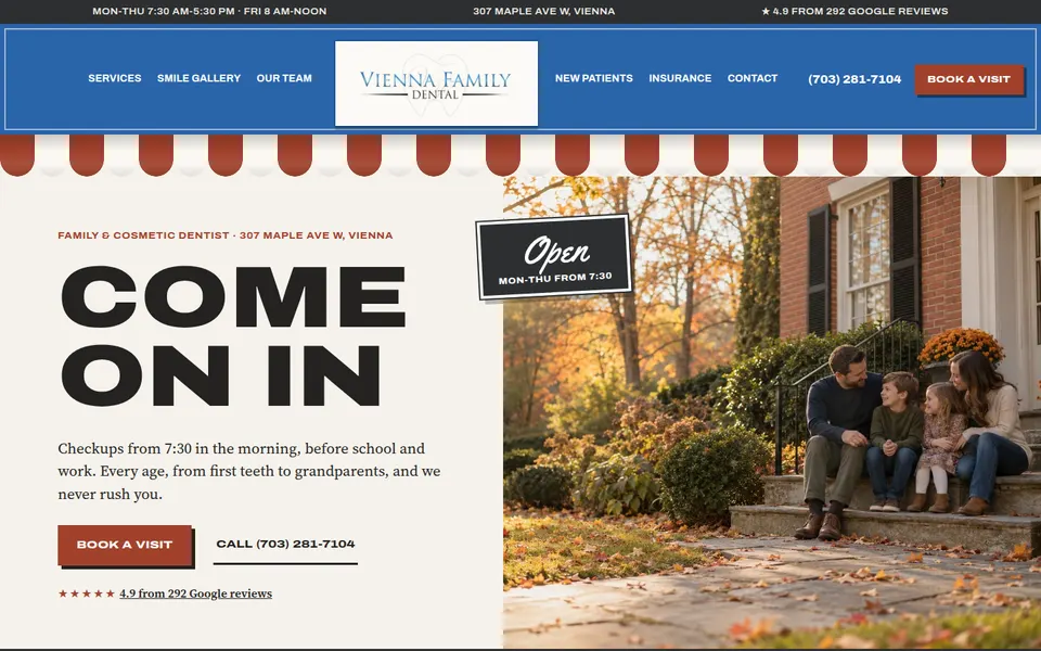
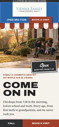
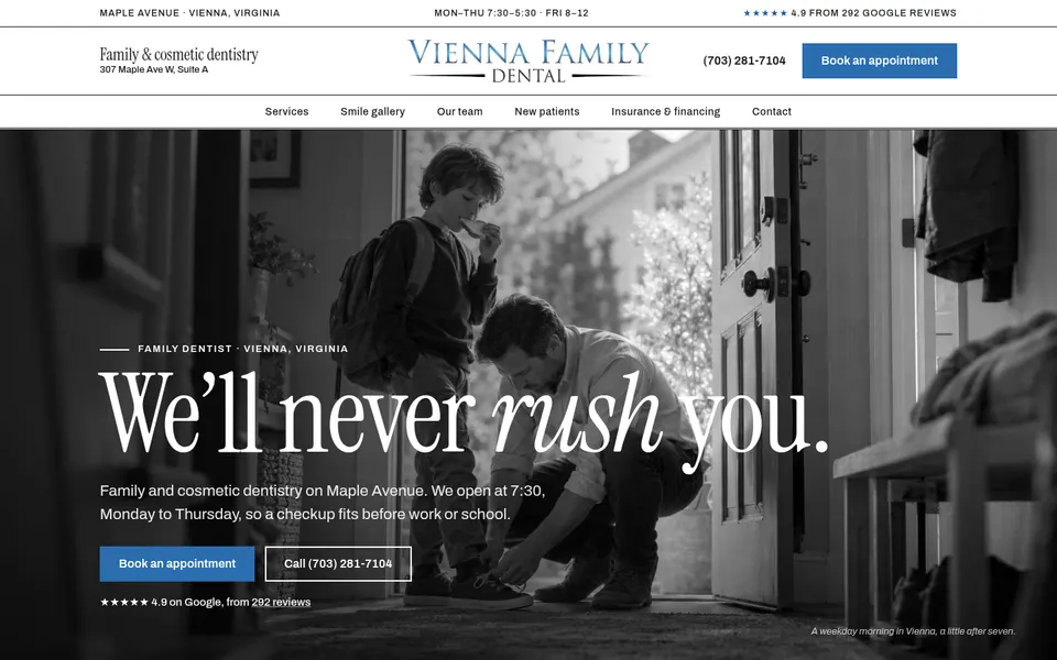
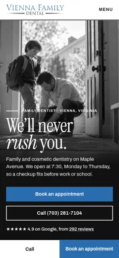
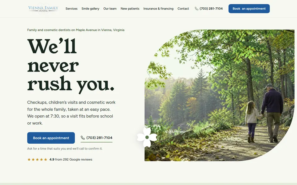
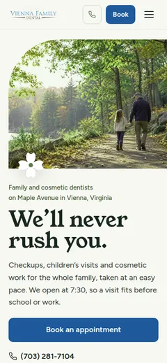
Five pages that finally look nothing alike: keep that. But the words were alike: four of the five H1s were "We'll never rush you." (the practice's own line) and most supporting lines said the same thing about 7:30 before school. Each page should have its own take on the words, in its own voice.
Leave notes on the designs you'd like revised (open one and press Alt+Shift+S), then pick designers for the rest: up to six in all. Your notes on the round go in on the next page.
Build the next roundConvergence is broken: five clearly different pages, each unmistakably its direction, with no shared hero layout. The directions did most of it; the library halves helped (but A and E still share a hero photo: a half of 7 heroes overlaps a lot). The SVGs and the tint tool were used: D's black-and-white essay and E's recolored illustrations. Headlines are short everywhere. New convergence: four of five H1s are 'We'll never rush you.', the practice's own line from facts.md, the one obvious short phrase.
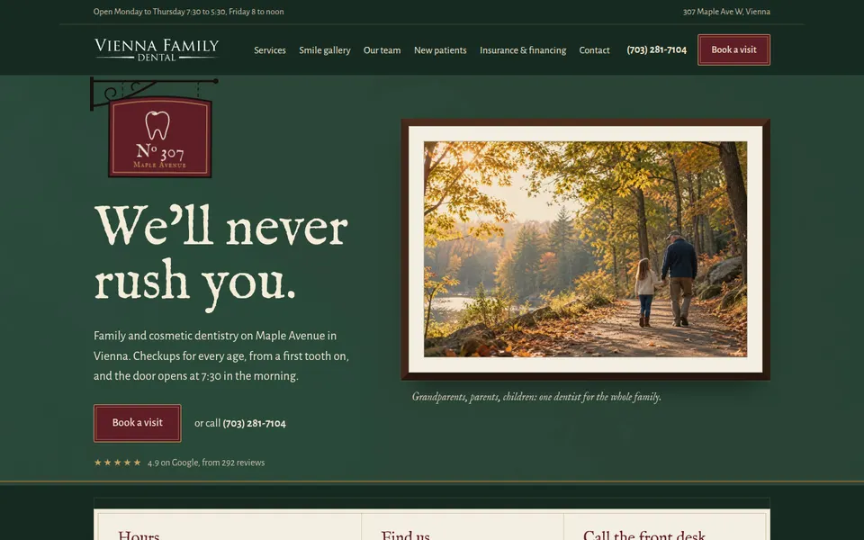
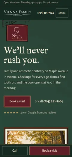
| Country inn 8/10 | Country inn carried all the way: a hanging '№ 307 Maple Avenue' sign, framed photographs hung like a salon wall, deep green and oxblood. Nothing like rounds 1-3. | Dark and heavy over a long page; the framed-picture device repeats a lot; the trail photo hero is the same as E's. |
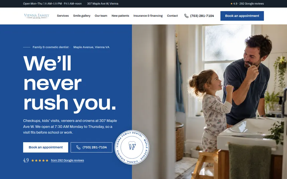
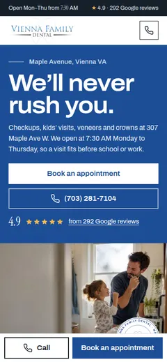
| Modern heritage 7/10 | Clean, confident modern heritage: a strong blue block, a circular seal, a good results band and a well-made booking section. | The closest to a template of the five: a split hero with a blue panel is round 3's layout again, and the middle reads like a polished stock theme. The required pattern ground fought the reviewer. |
| Main Street shop 8/10 | The most distinct: an awning, an 'Open' sign, before/after pairs on a wooden shelf with paper tags, a door-hours card. Reads like a real Church Street shop, warm and local. | Heavy extended caps everywhere push it past 'refined'; a busy page, some sections crowd. |
| Town paper 9/10 | Town paper is the best page of all four rounds: black-and-white photo essay (the tint tool), one blue, big editorial serif, columns and captions, color saved for the real smiles. Premium and very local. | Long (15 desktop slices); black and white everywhere may read cold to some families. |
| The garden 7/10 | The garden is fresh and calm, light sage, leaf-shaped photo crops and the recolored line illustrations on service tiles used well. | Softer and more generic than the others, edging toward a wellness template; the same trail hero photo as A. |