Vienna Family Dental6 designsOct 12Round notes
Open a design and press Alt+Shift+S (⌥⇧S) to leave a note on part of it, or use its Feedback button. Notes wait on the design until you build a round with it.
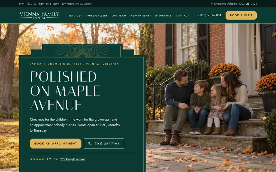
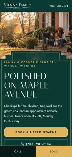
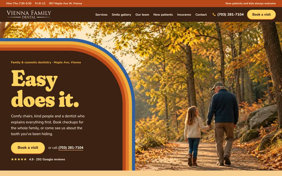
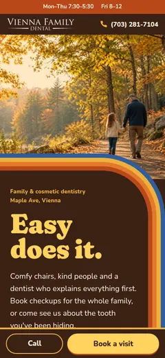
Leave notes on the designs you'd like revised (open one and press Alt+Shift+S), then pick designers for the rest: up to six in all. Your notes on the round go in on the next page.
Build the next roundThe bolder directions worked: six pages that are each fun in a different way and still read as a trustworthy practice. Reviewers shipped all six at 8-8.5. Every H1 is different and none is the slogan; the voices show in the copy. Remaining sameness is the photos: two pairs share a hero (A/B brushing, D/F trail walk), because the library has only a handful of strong lead images and the people group feeds heroes too.
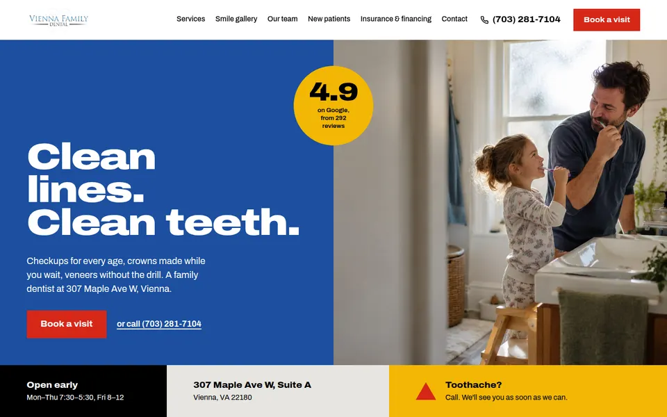
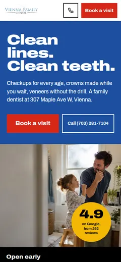
| Bauhaus 8.5/10 | Bauhaus done with real conviction: primary blue, red and yellow blocks as structure, circles and triangles, a hard grid, a services grid that reads like a poster, 'Pick a morning.' at the end. Fun and still clearly a serious practice. | Hero photo is the same dad-and-daughter brushing shot as B; a few sections lean on the same color-block trick. |
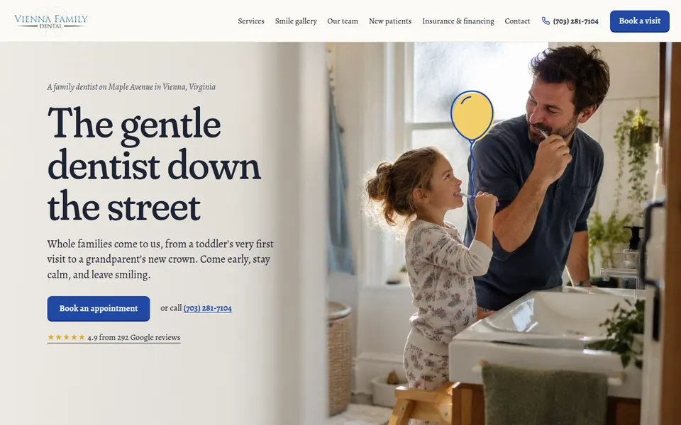
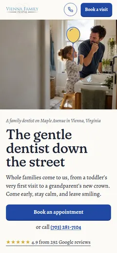
| Storybook 7/10 | Storybook is gentle and well written ('The gentle dentist down the street'), a nice book-like serif, a night-sky sleep section, a little drawn street of houses at the bottom. | The least committed to its direction: mostly a calm standard page with a balloon on it; the same hero photo as A. |
| Art Deco 8.5/10 | Art Deco is premium and exact: deep green and brass, stepped frames and sunburst lines, thin tall capitals, 'Results worth framing' with the real cases framed. The most 'premium and refined' of the six. | Long, and the dark green throughout gets heavy; small letterspaced caps add up. |
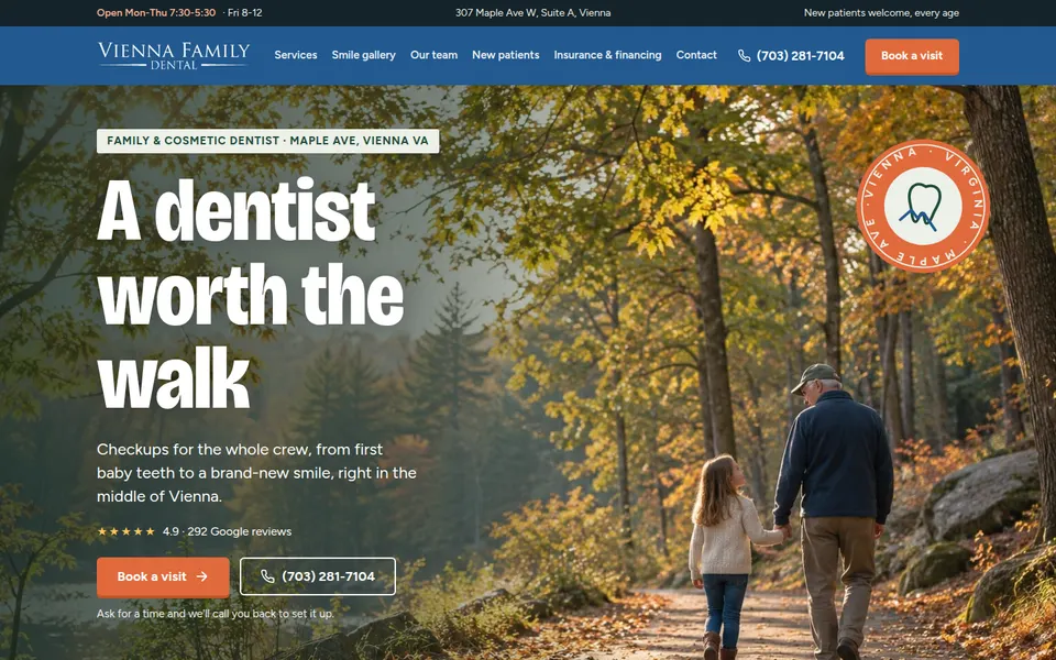
| Seventies sunshine 8/10 | Seventies sunshine is the most fun: rainbow arcs, rounded heavy type, warm brown and gold, arched photo frames, 'Easy does it.' Warm and friendly without losing professionalism. | The same trail-walk hero as F; very warm and brown all the way down, a lighter break mid-page would help. |
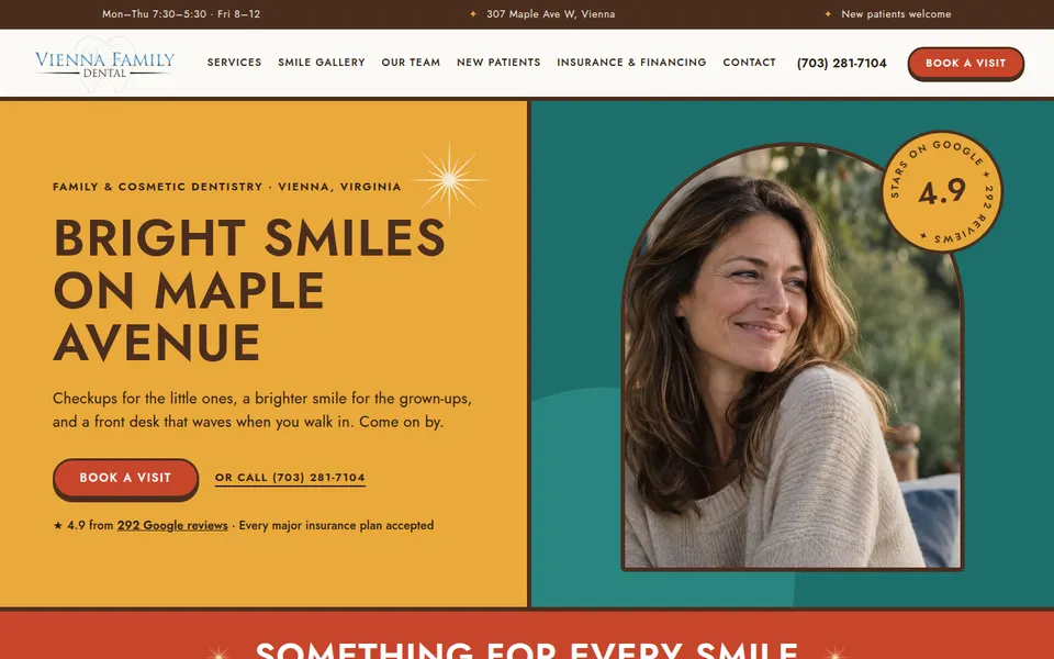
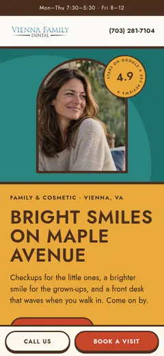
| Mid-century modern 8/10 | Mid-century modern is cheerful and bold: mustard, teal and tomato, starbursts, arched portraits, a tile grid of services with drawn icons, round '4.9' badge. | Busy: nearly every section is a different colored panel; the many colors push against 'refined'. |
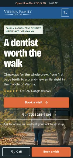
| Trail guide 8/10 | Trail guide is local and adventurous: 'A dentist worth the walk', a trail badge, 'Pick your trail' services, a contour-map texture, a real map and Vienna landmarks as a 'make a morning of it' strip. | The same trail hero as D; the middle reads more like a standard page than a park poster, the screen-print illustrations promised by the direction are thin. |