Vienna Family Dental5 designsOct 11Round notes
Open a design and press Alt+Shift+S (⌥⇧S) to leave a note on part of it, or use its Feedback button. Notes wait on the design until you build a round with it.
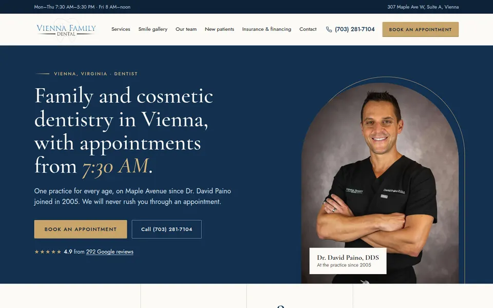
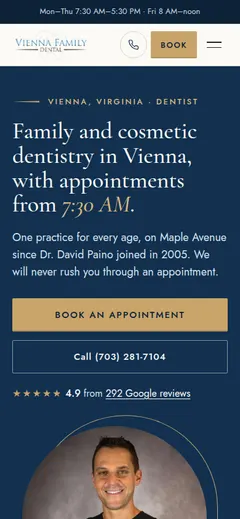
Five designers built this page before you. The owner's verdict: none was good enough.
Leave notes on the designs you'd like revised (open one and press Alt+Shift+S), then pick designers for the rest: up to six in all. Your notes on the round go in on the next page.
Build the next roundThe headline result: all five converged on the same look (a Garamond-style serif, cream, navy, gold accents, Dr. Paino in the hero, a stat strip, a ruled service list, before/after, a nervous-patients band, a team grid). The strategies changed how well it was done (D and B are clearly better than A and C), not what it was. Given the same brief (premium, traditional, a blue serif logo) the model always lands on the same 'premium dentist' answer. Variety won't come from better instructions alone: the direction has to be assigned (a named style, a palette family, a type pairing it wouldn't default to), and the defaults (Cormorant, cream + navy + gold, split hero with the doctor) named as things to avoid unless chosen on purpose.
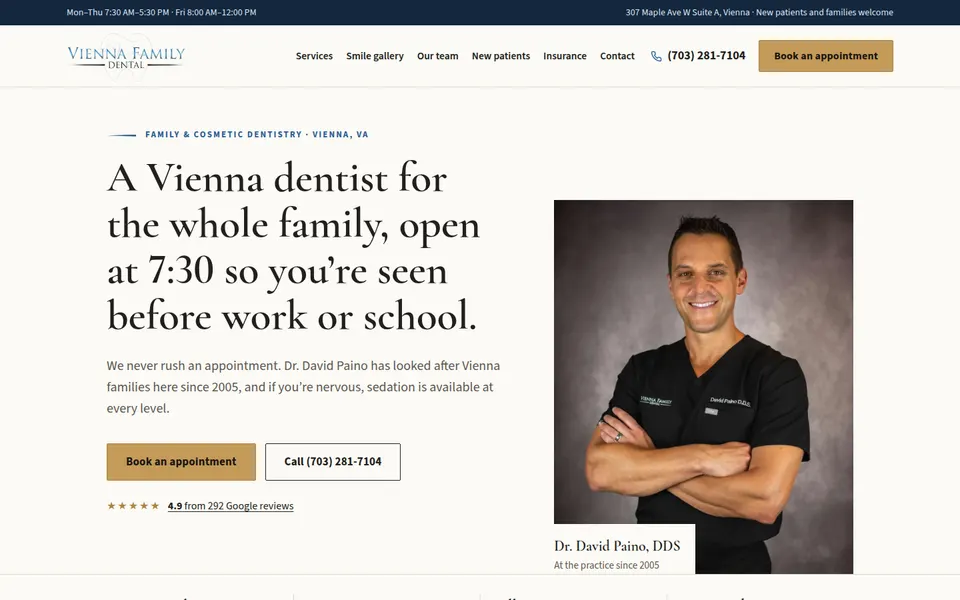
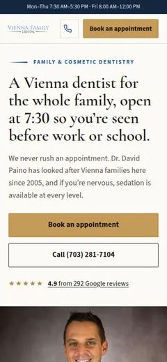
| S1 · Baseline 6/10 | The best copy of the five: "open at 7:30 so you're seen before work or school" and "Trish has answered our phone since 1989" are true, specific and only this practice can say them. The year-joined team timeline is a nice idea. The insurance section is clear. | It looks like a default "premium dental" template: split hero with a boxed portrait, cream sections, small label over heading over content. Too many plain cream sections in a row; the services list is a wall of text; the dark sedation band is the only real change of pace. The gold button on cream is weak. |
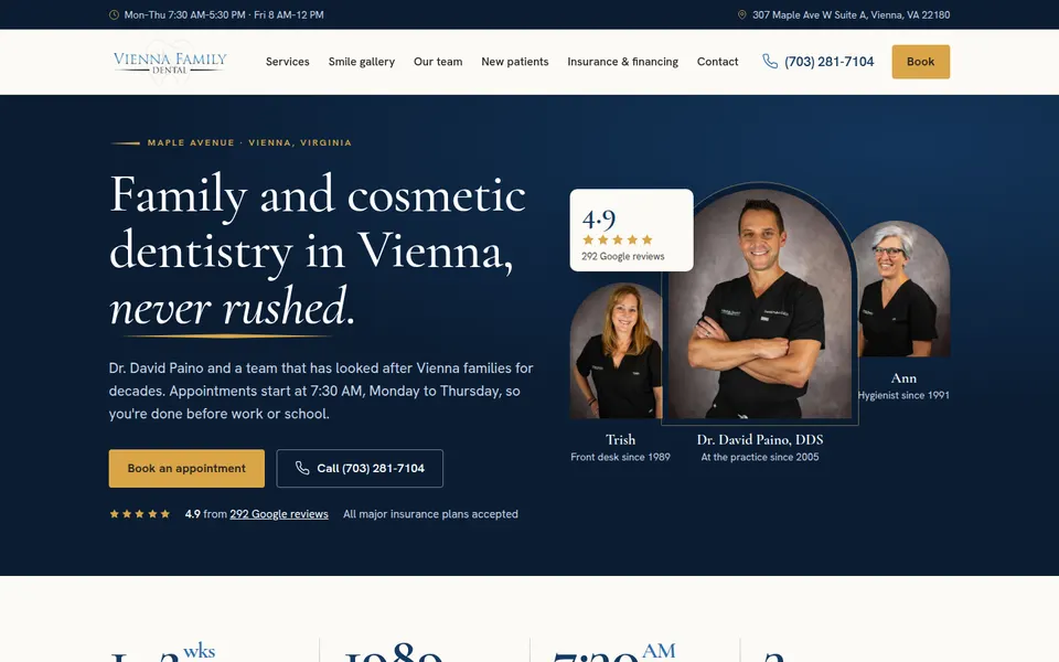
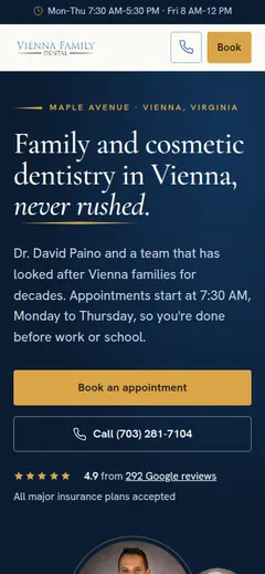
| S4 · Surface and treatment library 7/10 | The hero has a real composition: three arch-masked portraits with the 4.9 card overlapping them, on a deep blue gradient. Big serif numerals (1-2 wks, 1989, 7:30 AM). The faint rule pattern behind the nervous-patients section, the dark gallery band and the insurance bento (a dark card plus tiles) give it real changes of surface. The richest page of the round. | Same serif + cream + navy + gold as the others, so it's "premium dental" again, just better dressed. The arches feel generic-luxury. The services grid is long and evenly weighted. Lots of small numbered labels (01 · SERVICES) start to feel like decoration for its own sake. |
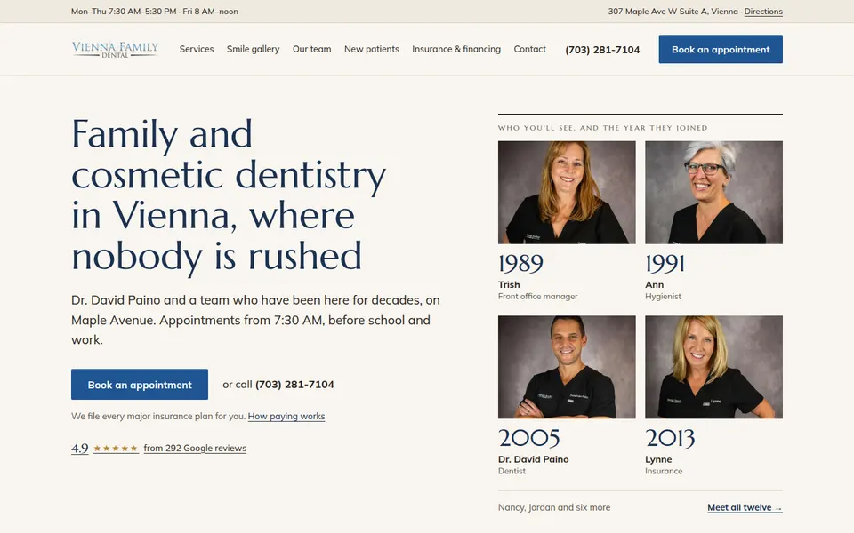
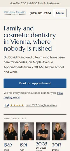
| S5 · Explore and select 6/10 | "1989" set huge over Trish's portrait on a warm charcoal band is the single best moment of the round: it's this practice's story, not a template's. The Marcellus display face differs from the rest. Year-joined portraits in the hero are a good idea. | Everything except that band is quiet to the point of plain: cream on cream, light type, timid section changes. The hero is another text-left, photos-right split. Children and insurance are two columns of bullets. It needs three or four more moments like the 1989 one. |
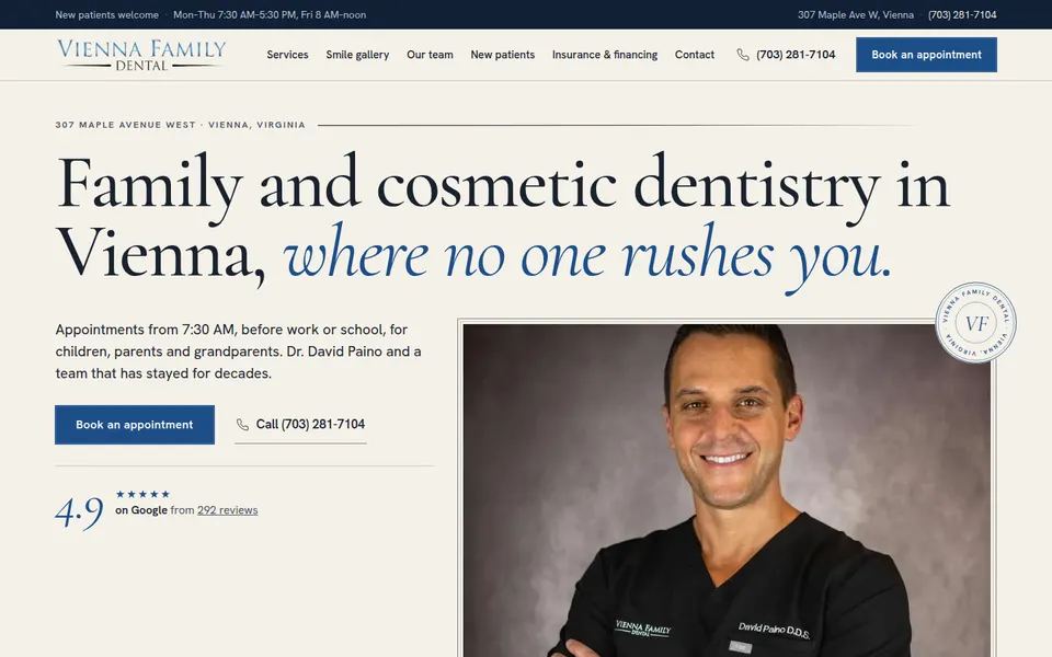
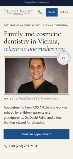
| S2 · Style playbooks 8/10 | The only one with a concept you can name: a finely printed book. The full-width headline with an italic blue phrase, the circular VF seal, "Plate I" captions on framed photos, roman numerals, a drop cap, the signature-style name, the ruled credentials table. The services index is elegant; the sedation section on navy is well composed. Every section looks designed, not filled in. | Still the cream / navy / Garamond palette every design reached for, so at a squint it's not far from A. The first screen is mostly type and one framed photo, no color field. The italic-blue phrase is in nearly every headline and turns into a tic. |
| S3 · Reference-led 7/10 | Very polished and balanced: navy hero with an arched portrait and a gold hairline, a clean stats strip, a strong veneers feature, the centered nervous-patients quote, the doctors in arches. No obvious mistakes anywhere. | It's B and A again: same fonts, colors, arch, stat strip and ruled services list. Accomplished but forgettable; nothing on it couldn't be on another cosmetic dentist's site. Letterspaced uppercase gold buttons feel salon-like. |