Vienna Family Dental5 designsOct 11Round notes
Open a design and press Alt+Shift+S (⌥⇧S) to leave a note on part of it, or use its Feedback button. Notes wait on the design until you build a round with it.
Five more designers built it with stock photos. "Quite a bit better." Pages full of photography, distinct directions, tenure kept to a detail: keep all that. One light steer, not a style to swing into: a bit more local business and less SaaS, closer to a well-loved neighborhood practice or shop than a tech product's landing page. And free stock was thin: several designers ended up with the same photos, which is what the library is for.
Leave notes on the designs you'd like revised (open one and press Alt+Shift+S), then pick designers for the rest: up to six in all. Your notes on the round go in on the next page.
Build the next roundA big step from round 1: all five are photo-led, none is cream/navy/gold, and tenure has gone back to being a detail. Stock was the single biggest change. Three findings. (1) The direction finally varies: refined serif (B), photo-warm (A), agency-bold (C), poster-varied (E), safe split (D). But the bold ones (C, E) overshoot the owner's 'premium, traditional' look while the refined one (B) runs thin; the next method should hold both: B's restraint with A's and E's image density. (2) Free stock is too small a pool: two pairs of designs share the same hero photo (A/D, B/C) and some picks are weak. The generated library should fix this and give one consistent look. (3) Reviewing: a fresh critic every round (s8) didn't work. Scores stayed flat at 6 because each critic wanted something different and the builder kept re-doing the hero. Critique needs continuity (the same critic, or the previous critique and a fixed rubric) and should target the bottom of the page, which is weaker than the top in every design. The cheapest method (Anthropic's skill, $2.64) was as good as the most expensive ($11).
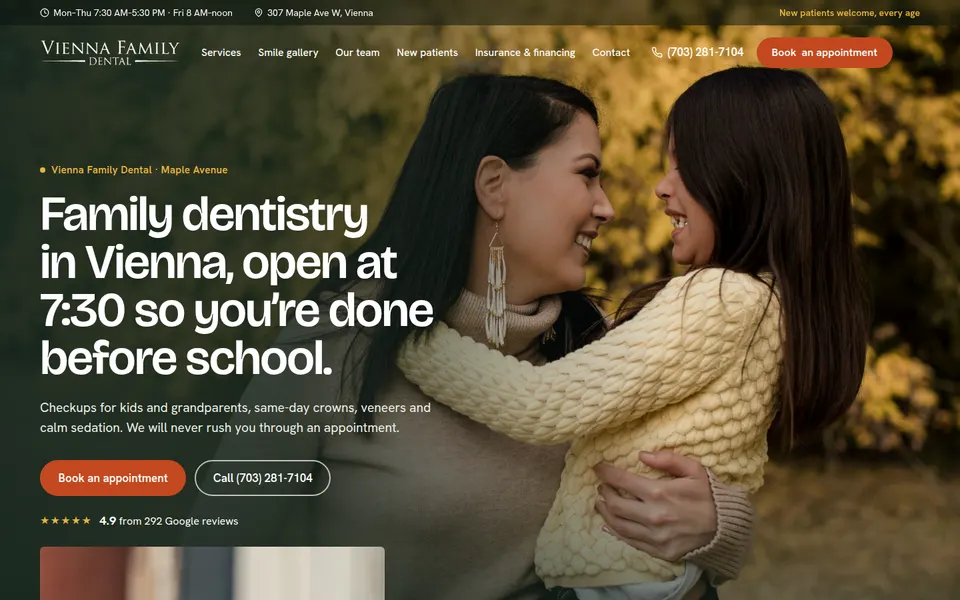
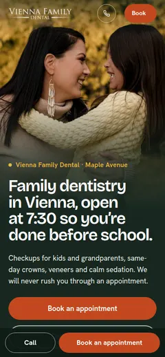
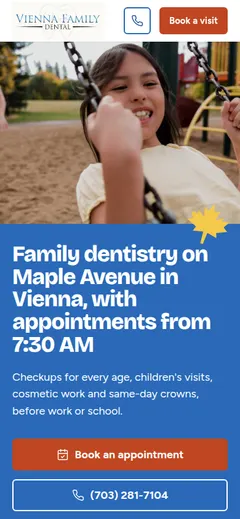
| S6 · Photo art director 7/10 | The most photographic page of the round: a full-bleed warm hero with the headline on the photo, and a photo in nearly every section (service tiles, the nervous-patients band, the kids block, the insurance couple, a review set over an autumn forest, FAQ thumbnails). The color comes from the photos (autumn gold, forest green, rust), so it feels like one shoot. The headline "open at 7:30 so you're done before school" is specific and useful. Phone hero is strong. | Too much: 15+ sections, lots of small text in every band, so it reads busy rather than art-directed. The geometric sans + orange pill buttons is a familiar modern-template look. Some stock photos (the boy with the backpack, the FAQ thumbnails) are weaker than the rest and break the set. |
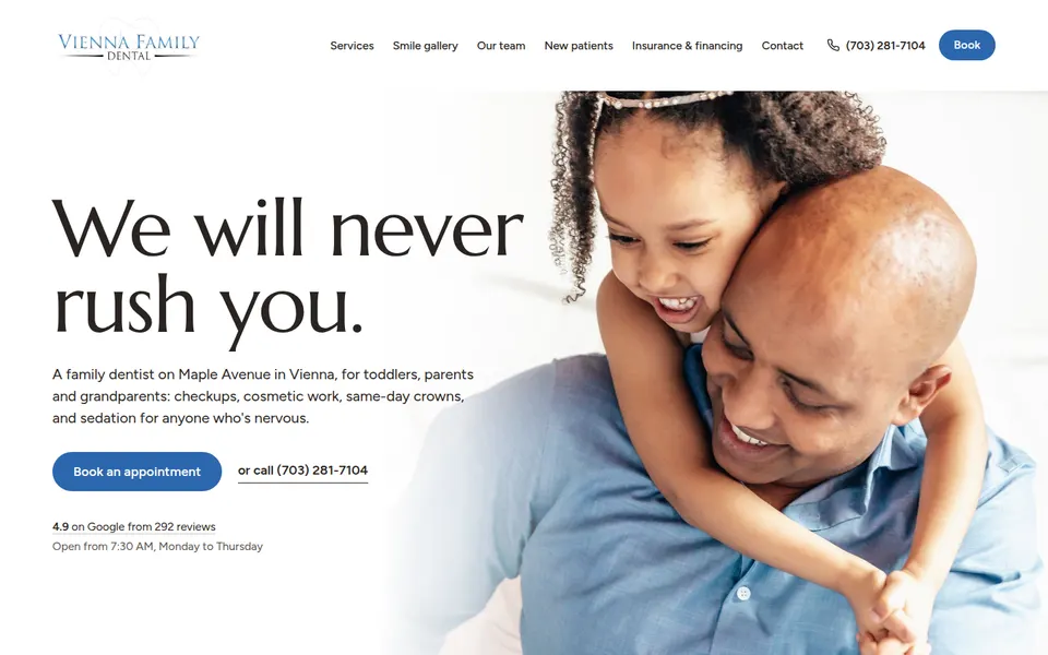
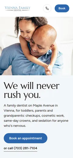
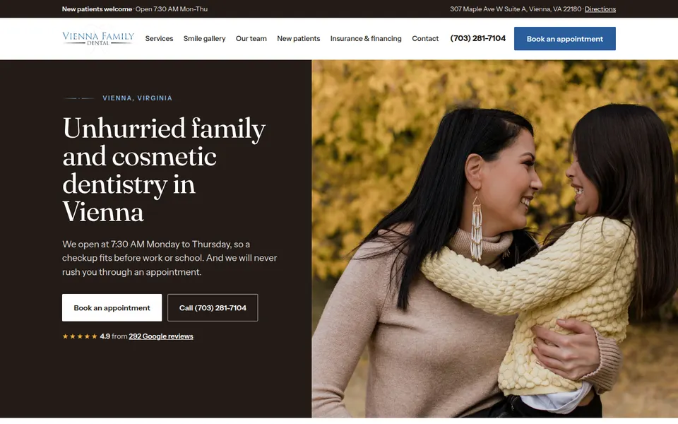
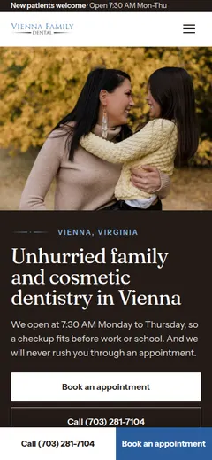
| S10 · Anthropic's frontend-design skill 7/10 | The calmest and most "premium" of the round: a big refined serif headline ("We will never rush you.") against a photo that bleeds off the right edge, lots of white space, real results given room, and the team on a warm dark band with Dr. Paino's quote. It's the only one that reads refined and traditional without the cream/navy/gold kit. Cheapest build ($2.64, 15 min). | Fewer images than the others and the lower half goes thin: "What we do" is a plain three-column list, the payment section is text only. The same stock hero photo as C. The ending (book, worth reading) is quiet to the point of flat. |
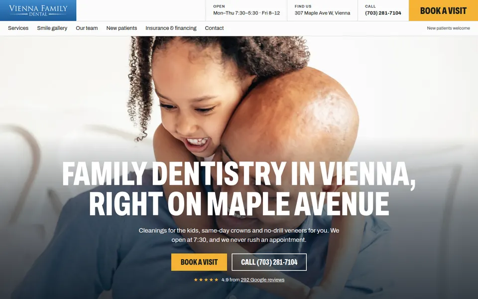
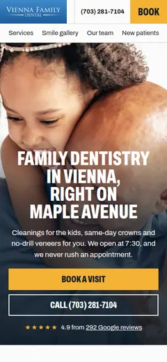
| S7 · Blueprint remix 7/10 | Looks the most like an agency built it: a strong grid, condensed uppercase headings, a yellow + blue palette taken from the logo, and every section full of images (services as photo cards, before/after strip, a nervous-patients 3-up, a team mosaic with a yellow "Book with us" tile, a blog row). Great rhythm of light / blue / dark bands. The utility header (Open / Find us / Call / BOOK A VISIT) is a nice real-site detail. | The condensed all-caps headings feel like a gym or a brewery, not premium and traditional: it's the opposite of the owner's look. Shares its hero photo with B. The services row clips off the right edge (a carousel without controls). |
| S8 · Critic loop 6/10 | Clean and trustworthy, with a warm brown-black instead of navy; the results section on dark is well composed; the crown-in-one-visit steps are clear; the team as a full-bleed strip of portraits is a good use of the gray-backdrop photos. | The safest page: a split hero (text left, photo right) and mostly white sections with a photo beside text, so it's closer to round 1 than anything else here. Four critic rounds didn't move the score (6.5, 6, 6, 6): each fresh critic gave a different, sometimes contradictory brief (round 3's hero was called "the most template hero there is" after round 2 asked for it). The most expensive build ($11, 49 min) for the least distinctive result. |
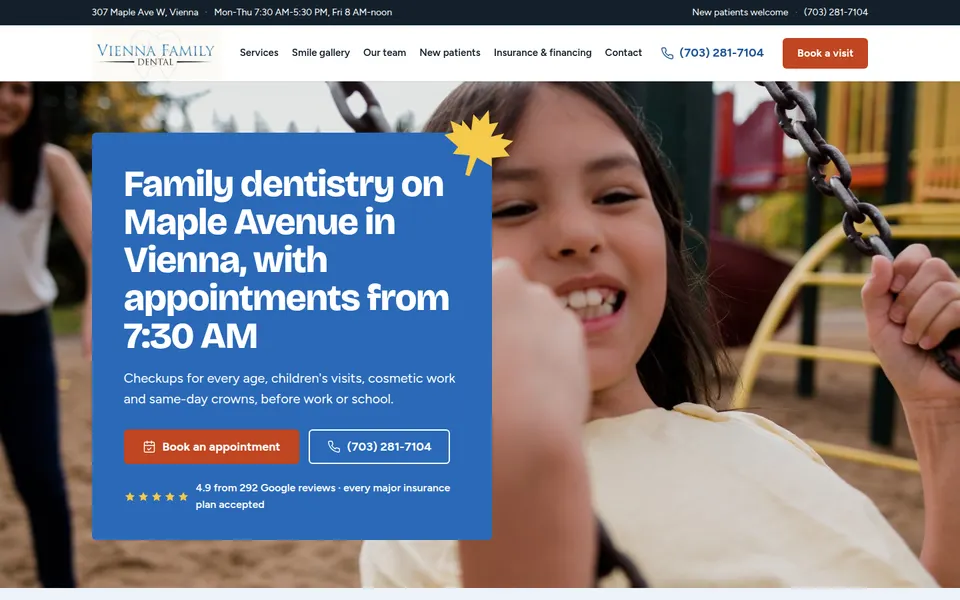
| S9 · Section posters 7/10 | The most varied page: every section is a different idea (a blue panel over a swing photo with a maple-leaf mark, a big 4.9 proof band, a photo mosaic of services, a blue sedation band, a full-bleed rust veneers poster, the dentist's story, a yellow kids' card over a photo, a green insurance band with icons, an illustrated map). The maple leaf (Maple Avenue) is a real, ownable motif. It never looks like a template. | Loud and playful: bright blue, rust, yellow and green bands one after another read as a kids' brand or a pediatric clinic, not "premium, refined, traditional". It's a patchwork more than one system; it needs one or two fewer colors and quieter type. The logo sits in a beige box (the JPG background). |